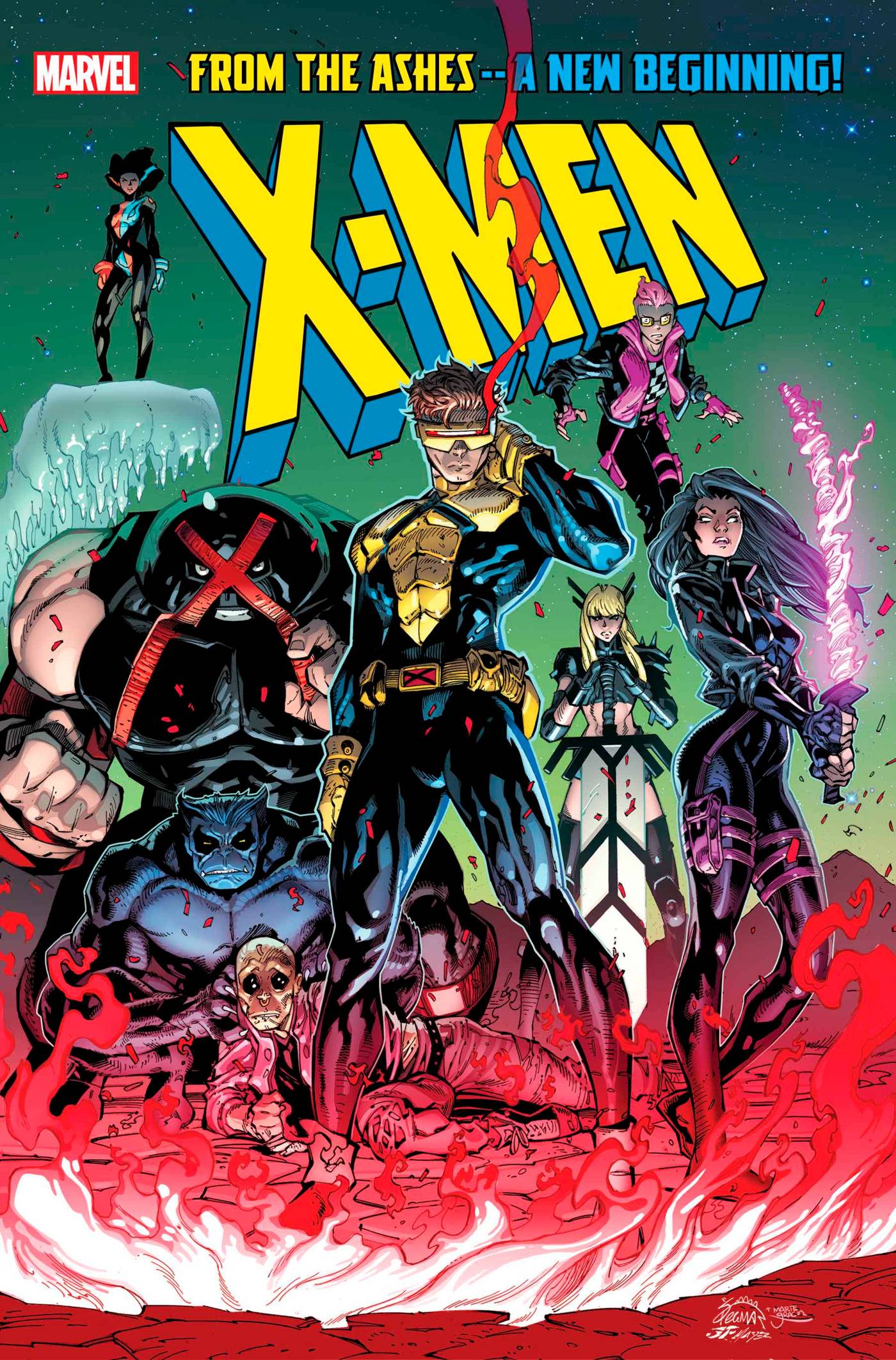
Figure 1 – Original X man comic cover, image from major spoilers website
Growing up, I used to read every and any superhero comic I could get my hands on. I have multiple old additions of the X men series hanging up on the wall of my childhood room. This was a really exciting project for me to look at some of my favorite comic book artists, and how they successfully illustrate the same comic series simultaneously. For this project, I wanted to look at the frequency that each artist drew each character on the iconic cover pages that they created. This would help see if the series was strict on each artist sticking to a set of characters, or if the comic series followed some other sort of pattern when assigning who got to make the comic covers for each issue.
Radial Chart, created using Flourish
Most Frequent Characters

Wolverine (Image from Marvel)

Storm (image from Hero or Villain)

Psylocke (image from Popverse)
Sources
The source used to produce this data, “uncanny-xmen-220-280-covers.csv was retrieved from class google drive.21212212
This data was then cleaned using the following steps:
1) I split the cells with multiple characters (almost all of them) into individual columns, so I could count each title appearance as a separate entry.
2) I re-ordered the columns and removed any of the data that was not relevant to what I was trying to visualize, such as dialogue and descriptions.
3) I filled all blank rows from step 1 with the appropriate Issue # as well as Cover Author, to make processing on Flourish easier.
4) I used the OpenRefine “cluster” feature to remove discrepancies that would make the same character appear as separate characters
5) I chose only the characters that had 2 or more repetitions when exporting the data as an excel file, as many characters appeared only once and cluttered the visualization.
6) I imported the data set into flourish, and used the interactive website to create a interactive radial graph.
7) I used carl sites to create a new subdomain for my midterm website and created this blog, using the design features from the website to clean it up!
Presentation/Process
The dataset had a lot of irrelevant columns, like characters speaking and special notes, and including these would take away from the point I was trying to make. The reason why I chose to go with Flourish, and specifically a radial chart, is because I believed that it was the best way to visualize the data that I had in a concise way. The other kinds of charts and graphs felt too cluttered with the large number of categorical variables. A network chart could have worked, but I liked the radial design better, as it felt more organized and allowed me to make a clearer point about the comparison of authors frequency, rather than just which authors drew what. The radial chart allows me to present the viewer a visible link from each author to each of the characters that they designed. The circle draws the sight of the viewer inward, forcing them to trace the connection from author to character. Additionally, by removing the one off, rarely drawn characters, I was able to make more prominent conclusions, without distracting the viewer with irrelevant characters.
For my website, I chose to embed the chart after an introduction and a few graphics. I think that adding images of the characters helps visualize the difference in drawing styles that each artist covers. For DH projects in general, I have found that the most effective communications have been prefaced, and not just a visualization with no explanation. I chose to keep my wordpress site relatively simple, to avoid unnecessary distractions. Additionally, I believe that the interactive embedded graphic allows readers to focus in on what they want. For example, if a viewer really likes one artist in particular, they can select to only view characters of that author.
Signifigance
Going into this project, I hypothesized that every artist would have one or two characters that they really focus on, to keep constancy and fluidity through all of the issues. I also thought that the series would only have 5 or so artists. However, I noticed something completely different. The most popular characters drawn by many different artists, including some really out of the ordinary ones like “Uncredited on Marvel.com”. This shows the absolute diversity of artists in the x men series, and the amount of different opinions that go into designing each cover character. Also, there is a much larger number of artists than what I originally expected. This shows how much the series valued diversity, which makes sense as the comic embodies a superhero team, rather than one character working by themselves. It is really interesting to see how much collaboration really went into making the comic book series.
Places where my project lack significance are the constraints within the dataset itself. Ideally, seeing how many times the characters are drawn in the entire comic would be more beneficial for analysis, as it shows the amount of times that each artist had to draw a new iteration of each character. Another limitation was that the data set only covered x men issues 220-280, rather than the whole series. If I were to do this project again, I would likely try and obtain a more detailed analysis of every panel in the comic, as more data would carry more statistical significance, and paint a broader picture.
In terms of the embodiment of DH, this project shows how anyone can really utilize a pre existing dataset, and make a broader point. Its kind of hard to imagine that something that is so non digital like an old comic book can be analyzed through these methods, but modern DH makes that possible. Its hard to wrap your head around how the conclusion of no real correlation between artist and character is significant, but it actually shows a lot about the nature of the series, and the process of comic making itself. None of this would be possible to visualize and show without the work of digital humanities.